
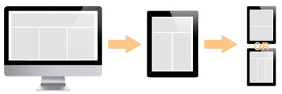
When you make responsive websites you often want to hide stuff on smaller screens. But what if the end-user really needs that piece of content on his phone? Back in the day with seperate mobile websites we would offer a link to the “desktop edition” of the page, but with mediaquery-based webpages the user is served the exact same file no matter the device. I thought about this for a while and came up with an idea to change the viewport size with javascript based on a cookie, and I found out that it actually works… it looks like this…
In the head of my html-file I have something like this
<meta name="viewport" content="width=device-width, maximum-scale=1" id="viewport">
I added the id=”viewport” to make selecting the tag easier. Below this line but before the content of the page I check if there is a cookie called desktop. If there is, I set the viewport size.
if (getCookie('desktop') == 'yes') {
  document.getElementById("viewport").setAttribute('content','width=1024');
}
At the bottom of the page (where you should be inserting all of your scripts) you add an eventlistener for the desktopLink to set the cookie and reload the page. You can also just change the viewport size without reloading, but the user will keep his current zoom-level and position, which typically isn’t what you want.
function setDesktop() {
  setCookie('desktop','yes',7);
  window.location.reload()
}
var l = document.getElementById('desktopLink');
l.addEventListener("click", setDesktop);
For dealing with cookies in Javascript I use the getCookie() and setCookie()-functions from w3schools - http://www.w3schools.com/js/js_cookies.asp